Research

The layout is very simple and organised. The main image on the right hand side of the page portrays the band ‘The Courteeners’ in a field, which represents this type of genre. Q magazine is quite an alternative/indie and quirky mag, which makes it so difficult to define which genre can be put into it. However, The Courteeners are quite an alt/indie band, and for them to be positioned face on with a minimal amount of expression in a field represented the genre quite well. A field is an open space – much like the capacity and constraints on this genre and magazine – it is left quite open for the audience to decide, which is subtly shown through the image. I do not believe it is a good idea for the audience to decide what type of genre a magazine is, I think it should be made clear to them, so that they can make an informed decision whether they want to purchase the magazine or not with no confusion. I will be making it quite clear that mine is a rock magazine.
The colour scheme consists of red, black, white and grey. The main text is black on white, making the colours contrast and easier to read– much like the previous contents page. Subheadings and page numbers are in red, which links to the icon of the magazine; which is a white Q on a red square. The box in the corner is grey, which may link to the grey and dullness of the picture. The main image is a long shot – taken from a lower angle –which again suggests (through semiotics) that they are superior to the audience as they are looking down on them.


There are 2 main images on this contents page, which
essentially make up one main image as they were taken at the same time with the
same lighting and same stage. The pictures show a band performing with all
sorts of instruments – perhaps highlighting the complexity of rock, as it is
not always just about the guitar. As they are performing on stage, the picture
is shot from a low angle, subtly hinting that the photographer was just a part
of the audience - much like the readers would be. This could be a form of
direct address through the medium of an image, as it is attempting to involve
the reader. The image is shot from an angle where it appears to be from the
perspective of the audience, showing what the concert would look like if they
went. This is an effective photographic technique, and is used for the majority
of pictures taken of bands performing live.
The main colour scheme consists of black, white and red. Red
is a typical colour for a rock magazine, as it has connotations such as fire
and anger – which is sometimes associated with rock, as the stereotype of this
genre is ‘anger’. Furthermore, NME’s logo is coloured in block red – this then
also helps a lot to link in with the colour scheme. The subheadings are on a
black fill with bold white text to contrast. This is an effective use of contrasting
colours, as it really draws the reader’s attention to where it needs to be on
the contents page in order to find what they’re looking for. However, one thing
that is incredibly noticeable is the use of yellow at the bottom of the page.
It is quite obvious that it doesn’t fit in with the colour scheme, and for a
good reason too. The use of yellow on black attracts the reader’s attention –
and has been done on purpose. As this part of the contents page is the
subscription ‘advert’ it has to be noticeable, thus explaining the use of a ‘contradictive
to the colour scheme’ yellow.
One interesting thing that NME contents pages include is the
‘Band Index’ on the left hand side of the page. It stands out as the text is
red, which is different to the text on the rest of the page. This section seems quite cluttered, and
after analysing this contents page I do not plan on including something similar
to this in mine.

The main image on the contents page is of ‘Alter Bridge’
performing. The picture is black and white, giving it a real effect as all
other images on the page are in colour. It shows the band performing, with two
of the members playing the guitar – a real piece of rock iconography. The image
is a mid to long shot, with the angle of the camera looking up – this results
in the band looking down into the camera, perhaps highlighting the fact that
they are superior and are far more involved in rock than the readers are.
The colour scheme works really well on this contents page,
as it is mainly yellow, black, white and red. The yellow of the colour scheme
is shown through the text, and is used on the text that the editors want to
highlight most to the readers – for example the headings and subheadings. The red is positioned on puffs within the
page and also on the numbers. In addition, red is quite clearly used to attract
the reader’s eye to the bottom of the page, as it is used as the background of
the subscription line – this is purposefully and carefully done so that if the
readers enjoy the magazine, they will subscribe, therefore leading Kerrang! to
receive more money.
The text is on the second half of the page, and is black
text on white. These contrast with one another, therefore making it easy to
read and follow. They are positioned into columns, which makes the whole layout
of the page very ordered and simple to read. There is one column on the left
hand side which is dedicated to the ‘Editor’s Note’, and has a picture of the
editor and their name at the bottom – this gives the magazine a much more
personal touch, knowing who the editor is and why they have put what they have
into this issue. Most contents pages of
all types of magazines have this now, and I believe I will also do this.
The font for the subheadings is very effective, and is
usually the same throughout most of the Kerrang! issues. The masthead of the
magazine is KERRANG! with cracks running through it, trying to create the
effect of smashed glass. This represents the genre brilliantly, as rock is
stereotyped as being ‘angry’ and ‘loud’, and smashed glass links with both of
these connotations.
I quite like this
layout as it is very aesthetically pleasing whilst still being ordered enough
to follow.
Language
The issue number and date is positioned right below the
title ‘CONTENTS’, but it does not distract away any attention from the title or
main image. There are many subheadings, but the one that jumps out the most is ‘WIN!’.
This is because of the exclamation point at the end, which immediately attracts
the reader’s attention when browsing this part of the page.
In the bottom right hand corner, in a text box it reads, ‘Get
K! delivered to your door for just £6 a month!’ – this quotation includes
direct address, which is a brilliant feature to use in media productions as it
really aims to involve the audience, and I believe it really does so. I will definitely be using direct address
somewhere in my production task, whether it will be in the contents page or on
the front cover or both.
On another part of the page, there is a quote that reads, ‘Kerrang!
Homegrown Heroes’. There are some quite strong connotations with the word ‘hero’,
including war and sacrifice. Therefore, is it justifiable to put this word into
a title about music? However, the quotation does also include alliteration;
another effective language technique. Perhaps the word ‘heroes’ was just used
as part of alliteration, or maybe Kerrang! really do see these bands as heroic.
One thing that I have noticed is that there are no pull
quotes from any articles on this contents page. I am not sure whether I prefer this in a contents page or if I would
like to include one in mine – I will decide later when I begin to make plans
and layouts for mine.
Flat Plan for Magazine
.jpg)


Flat Plan for Magazine
.jpg)
Planning
Layout 1

I quite like this plan, however I am unsure whether I will be able to position one of the images in that area as it's quite a difficult space to place it in. On the left hand side of where I have placed the 'Text and Order' box, I will also include some images to make it a more interesting layout.
Layout 2

I don't prefer this layout in general comapred to the first one, however having the contents and date/issue number at the bottom of the page is quite original. I may do this in my final contents page as I quite like the idea.
Layout 3

This is my third plan, and I think it is my favourite. Even though this contents page does not include the masthead at the bottom, I do prefer this layout. I will test it on the target audience and then decide which one to use.
Testing on the Target Audience
I asked people aged 16-24 (target audience) via Twitter which one they thought was the best layout for a contents page, and these were the results:

As layout 3 came out as the most popular and was also my favourite, I will be using this as my final layout.
Photos I will be using

This will be my main image, as it shows who the main cover story is about whilst being quite a flattering image. I believe it is quite a good image, with it being a mid-long shot with the camera angle pointed up at her. The size and edit is also fits the best within the contents page.

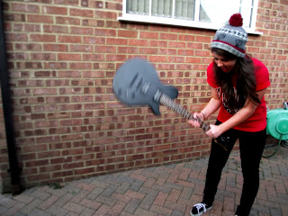
I do quite like this image, as it represents rock quite well and I would like to put it in my production somewhere. However, the main issue with this photo is the window and green wheel in the background. This then made me edit it to this image:
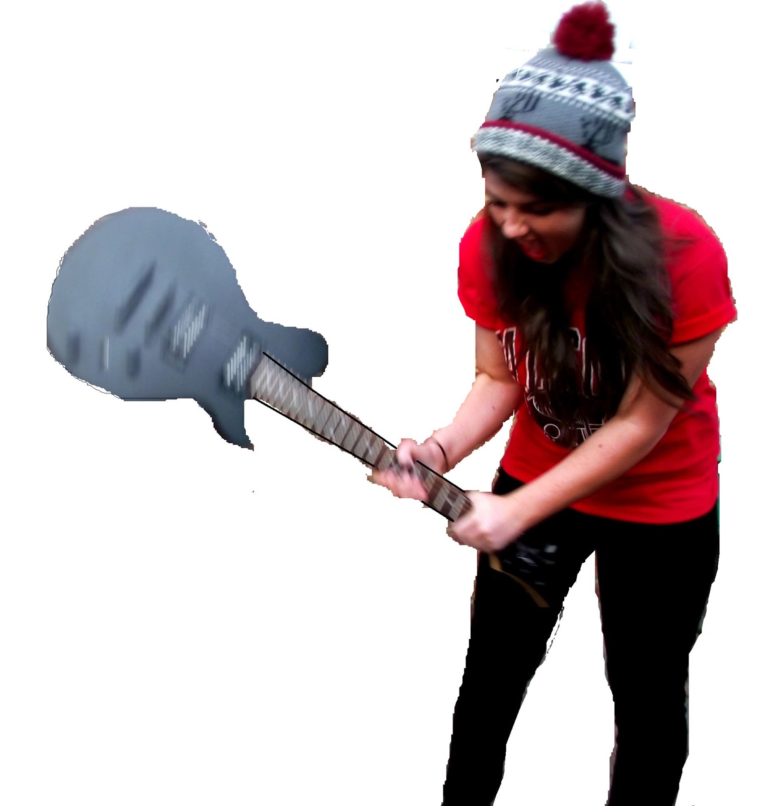
This is a much better image, and even though the guitar is a bit blurred I still quite like it as it portrays the stereotype of rock quite well, and I believe I do need to get this message across if I am to stick to some conventions of a typical rock magazine. When I put this image in, I will attempt to solve the issue of the blurred guitar.
Plans of what the contents will look like

This was my first plan of the top of the contents page. I positioned the main image on the left and put the editor's note on the right hand side. On this plan, I feel that the editor's section seems too bare, and after putting it on the left hand side it solved that issue. After planning some more, I decided that I much preferred the second way I tried.

Even though this plan consists of all the same images, they are placed in a different way, which I believe looks a lot better and much more like a real rock magazine.
2 mockups

This is my first complete mockup - I felt that the black didn't really work within the colour scheme, it seemed much to harsh for this magazine. The red of 'week' also did not look quite right, although the top half of this contents page was my favourite. I think I will decide to keep that and may change the bottom half in some ways, such as colour scheme and positioning.

This is my second mockup, and I much prefer this colour scheme. The top half of the page is not my favourite, so I may decide to swap some things between the two mockups. The positioning of the 'massive CD giveaway' and the subscription advert are swapped (compared to the first plan), but it makes the bottom left-hand corner look quite bare so I may decide to also change this.
I then tested the mockups on the target audience via twitter:

Much like my own opinion, the majority voted for the second one. As it is my favourite and also my target audience's favourite, I shall be using this one as my main template.
1st Draft

Final Contents Page

No comments:
Post a Comment